Despite still using Evernote as my Second Brain, I still use Apple Notes on occasion. While it’s gained more features over the years, one thing that really irritates me is the lack of simple customisation, especially the awful yellow colour of links.
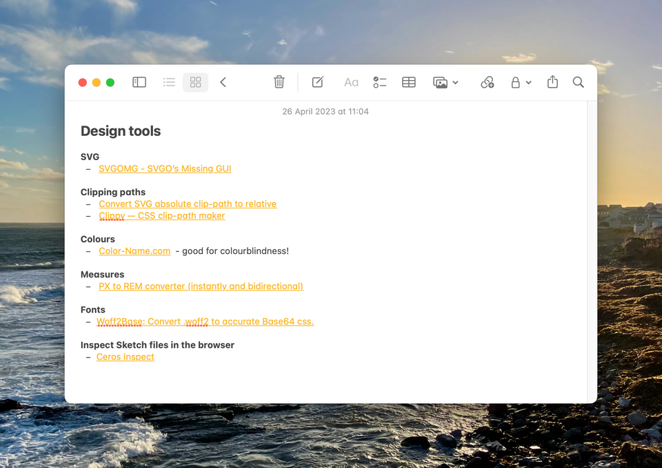
Perhaps it’s just me and my colour blindness but it does seem an odd choice. You’d think that someone at Apple would notice it’s really bad, or at least provide an obvious way to change it across all platforms. There are ways, but it’s not as straightforward as it should be.
macOS
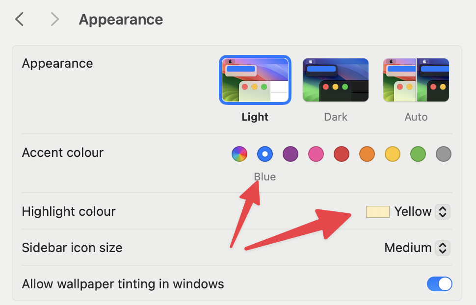
Turns out the colour on macOS is linked to the system wide Accent colour. To change it, you need to go to System Settings > Appearance and then change the Accent colour.
 Change the Accent and Highlight colours
I’ve altered the Accent colour to Blue. Also note that this changes the Highlight colour by default. I’ve set mine to Yellow. It’s a universal rule, links are blue, highlighter pens are yellow. That’s the way it’s supposed to be.
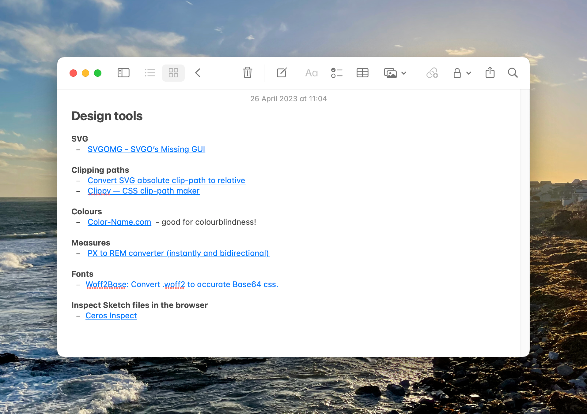 Much Better!
iPadOS and iOS
On the mobile OS it’s not possible to change the colour completely, but it can be improved with an Accessibility feature. This works the same for both iOS and iPadOS. Settings > Accessibility, scroll to the bottom and select Per-App Settings. Select Add App and search for Notes. You’ll want to turn Increase Contrast to On.
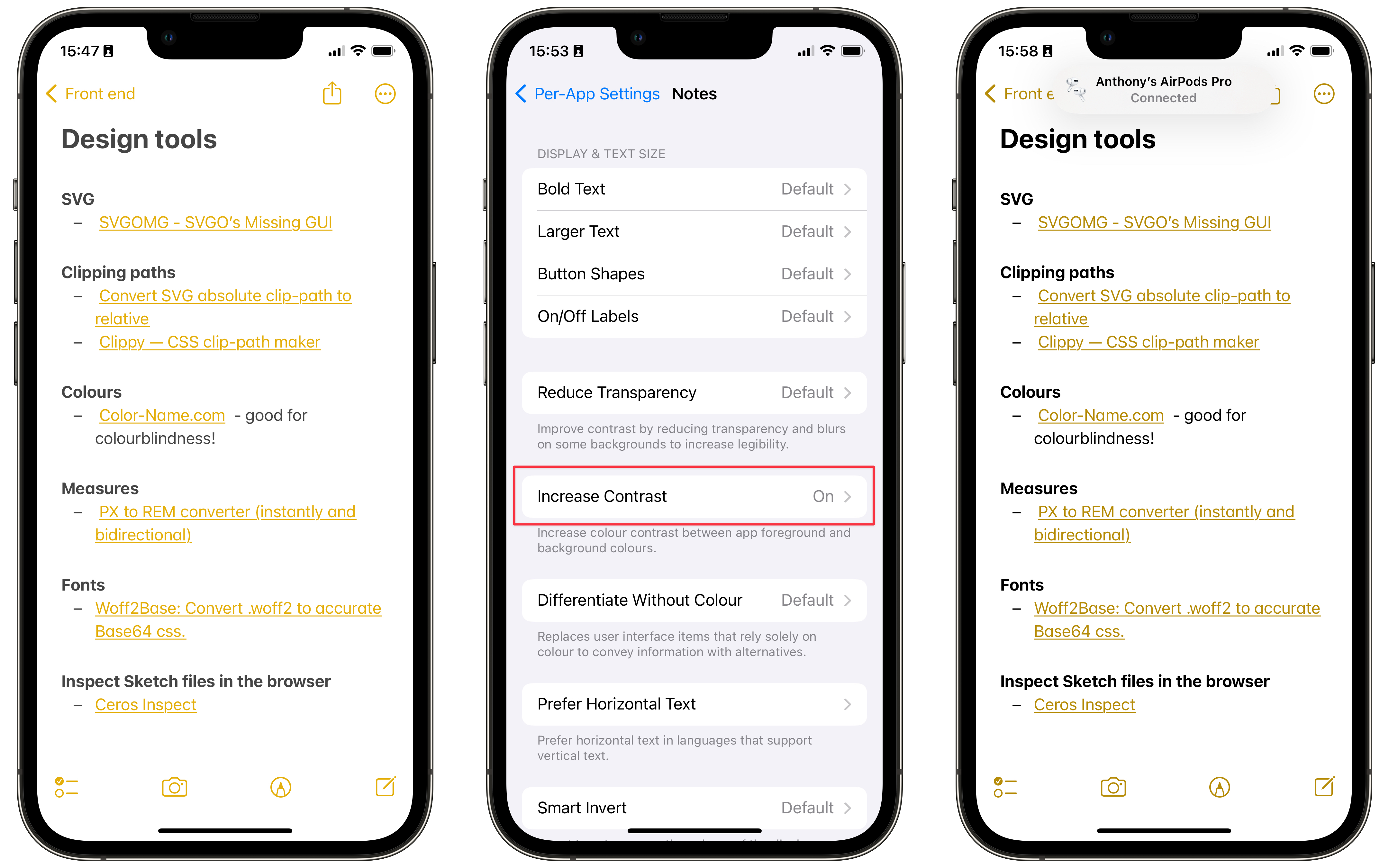 Once you change it, the original setting just looks wrong
Is it just me?
For anyone who is interested, I picked out the text and background colours and ran them through the WebAIM Contrast Checker and, of course, it fails with a contrast ratio of ~2:1. The fix on iOS does improve this number to ~3:1, but still reports as a failure. Here’s hoping this gets better in a future release.
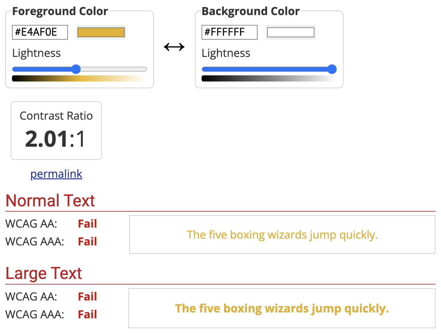 Screen capture of the WebAIM Contrast Checker